

Improving Checkout Experience: Tips to Reduce Cart Abandonment in 2025
Posted: September 12, 2025 | Updated:
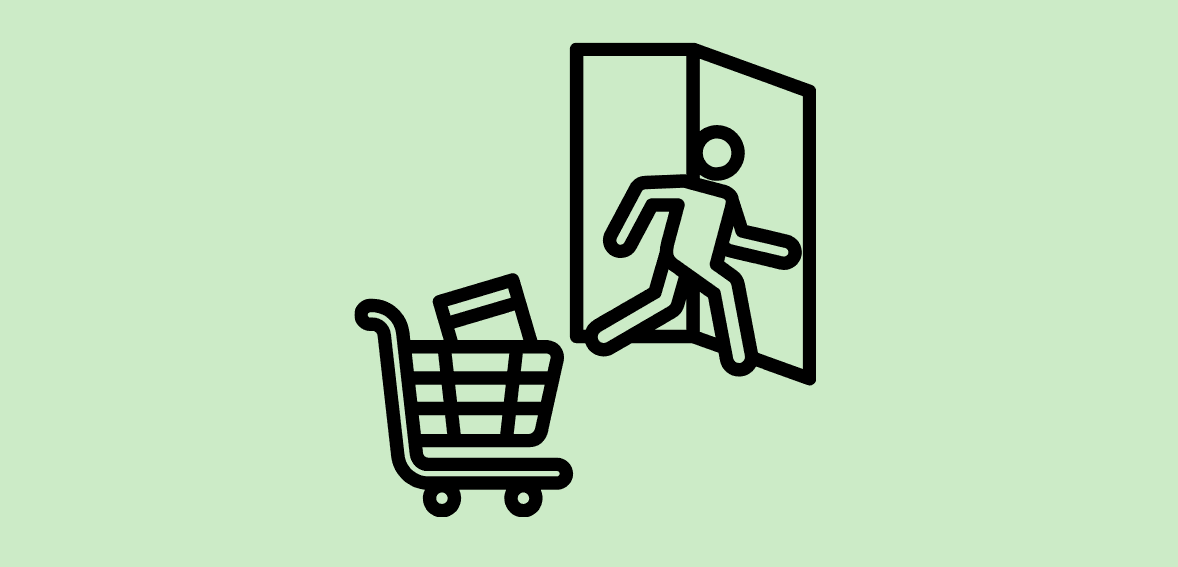
Online retailers in 2025 face a familiar yet critical challenge: shopping cart abandonment. On average, nearly 70% of e-commerce shopping carts are abandoned before checkout. This represents a massive loss in potential revenue. Researchers estimate that better checkout design could increase conversion rates by over 35%, translating to about $260 billion in recoverable sales in the US and EU alone.
Why are so many customers walking away at the last moment? Often it comes down to friction in the checkout process, surprise costs, or a lack of trust. Fortunately, these are issues retailers can fix with the right strategies. In this blog, we’ll explore how to improve the checkout experience and reduce cart abandonment, focusing on three key areas: simplifying the checkout process, offering multiple payment options with transparent pricing, and boosting trust through security signals. Top reasons why shoppers abandon their carts in 2025 include unexpected extra costs, forced account creation, and a long or confusing checkout process.
As mentioned above, factors like lack of trust in the site’s security and insufficient payment options also contribute significantly to abandoned carts. Addressing these pain points with a smoother, more transparent, and trustworthy checkout experience can help recover many of those lost sales.
Tips to Reduce Cart Abandonment in 2025
Simplify the Checkout Process
A complicated or tedious checkout is a conversion killer. Shoppers today have little patience for multi-page forms and unnecessary steps – around 18–22% of consumers have abandoned a cart simply because the checkout took too long or was too complex. Streamlining the process is therefore priority number one. The goal is to minimize the number of clicks and fields required for a customer to complete an order.
One central friction point is forced account creation. Many users don’t want the hassle of registering for an account to make a one-time purchase. About 1 in 5 shoppers abandon their cart when a site insists they create an account, and surveys indicate 40% of buyers would finish a purchase if they didn’t have to sign up for an account. The solution is to enable guest checkout. Allow customers to check out without creating an account (or make it optional/offered after the purchase). This removes a common barrier and can dramatically increase conversion rates.
Next, minimize the information required. Only ask for the essentials needed to fulfill the order – typically shipping address, contact info, and payment details. Every additional form field or page is an opportunity for the customer to quit. A recent usability study found the ideal checkout flow can be as short as 7–8 form fields (around 12–14 total form elements). Yet, the average site’s checkout uses roughly 15 form fields by default.
In other words, most retailers could cut out nearly half of their form elements to simplify the experience. Audit your checkout for any fields you can remove (for example, do you need a fax number or separate first/last name fields?). Also, use smart defaults and selections to reduce typing – for instance, automatically determine the shipping country from the billing address, or pre-select the cheapest shipping option.
Auto-fill and address lookup are your friends. Modern browsers and mobile devices can auto-fill common fields like name, address, and email from saved user data. Make sure your checkout is compatible with these features (use standard field naming and formatting). Even better, implement an address autocomplete service that suggests addresses as the user types – this speeds up entry and ensures accuracy.
Similarly, customers can save their payment methods or use digital wallets, eliminating the need to enter long card numbers. By leveraging these conveniences, you reduce friction and keystrokes required to check out.
Compress the checkout into as few steps as possible. A single-page checkout or a segmented one-page-per-step flow tends to work best. If multiple steps are necessary (e.g., Shipping -> Payment -> Review), make sure to display a progress indicator so users know how close they are to completion. For example, showing “Step 2 of 3” or a progress bar at the top can motivate users to finish since the end is in sight.
In 2025, a fast and mobile-friendly checkout is especially crucial – mobile e-commerce continues to grow, and nearly 79% of smartphone users have purchased their mobile device. Ensure your checkout layout is optimized for small screens: use large, tappable buttons and a form that fits without excessive scrolling.
It’s also wise to simplify choices on mobile; too many dropdowns or options can overwhelm users on a phone. And don’t forget performance: slow load times can increase abandonment by 75%, so streamline your checkout page for speed.
How Can You Do That?
Here are some concrete ways to simplify your checkout process:
- Enable Guest Checkout: Let customers purchase without creating an account (no forced sign-up). This removes a significant obstacle that causes many drop-offs.
- Reduce Form Fields: Only ask for necessary information. Use concise forms with clear labels, and eliminate any redundant or optional fields that aren’t truly needed.
- Use Auto-Fill & Address Autocomplete: Take advantage of browser auto-fill and provide address suggestions to minimize typing. Pre-fill country codes, city/state from ZIP code, etc., to save the customer effort.
- Combine Steps & Show Progress: If possible, use a single-page checkout or limit the number of pages. Indicate checkout steps with a progress bar or step numbers so users know they’re almost done.
- Optimize for Mobile: Design the checkout for mobile-first usability. Use large buttons, mobile-friendly payment options (like Apple Pay/Google Pay), and ensure pages load quickly on mobile networks. A smooth mobile experience is mandatory in 2025.
Offer Multiple Payment Options and Ensure Transparency
Another key to reducing abandonment is giving customers flexibility in payment and total clarity on costs. Shoppers have diverse preferences for how they pay online – and if they don’t see their preferred payment option, they might not complete the purchase. Approximately 9–10% of cart abandonments are due to a lack of sufficient payment methods at checkout, and studies show that around 40% of shoppers are more likely to buy when a store offers multiple payment options. The takeaway is simple: offer all the popular payment methods that your customers expect.
At a minimum, your checkout should accept major credit and debit cards (Visa, MasterCard, American Express, etc.) as well as a universal digital wallet like PayPal. Services like PayPal or Amazon Pay are widely trusted and allow users to pay without re-entering card details, which can speed up checkout. In addition, consider offering mobile wallets such as Apple Pay or Google Pay, which enable one-tap payments on mobile devices.
These options not only cater to user preference but also make mobile checkout faster by auto-filling billing and shipping info. Another rapidly growing option is “Buy Now, Pay Later” (BNPL) plans (e.g., Afterpay, Klarna, Affirm). BNPL has become popular among younger consumers and those who appreciate flexible financing – so much so that 40% of BNPL users say they would likely abandon a purchase if BNPL weren’t available.
If your target audience includes these shoppers, integrating a BNPL option at checkout can prevent losing those sales. The bottom line is to cover the spectrum of payment choices: from traditional cards to alternative methods. This includes any prominent local payment methods if you serve international customers, which we’ll discuss shortly.
Equally important is cost transparency throughout the checkout. The number one reason for cart abandonment is unexpected extra costs – surprise shipping fees, taxes, or other charges added at the end. Nearly 48% of US consumers have abandoned an order upon seeing additional costs during checkout, and about 14% abandon because they couldn’t see the total order cost upfront.
To avoid this “sticker shock,” be upfront about all costs early in the process. Display estimated shipping costs, taxes, or any fees on the cart page or as soon as the user enters their address, rather than waiting until the final confirmation page. Many sites now provide a shipping cost calculator or at least a clear shipping policy link in the cart. If you offer free shipping over a specific order value, make that known ahead of time and show the threshold. (Free shipping is a powerful incentive – about 50% of businesses have seen a sales boost after adding free shipping.)
The goal is that by the time the customer reaches payment, they already know precisely what the total will be, with no unpleasant surprises. Complete transparency builds trust and reduces the risk of last-second abandonment due to price frustration. For international or cross-border e-commerce, offering local payment methods and currencies is another form of transparency and convenience. Shoppers are far more likely to complete a purchase if they can pay in their preferred way.
For example, a customer in the Netherlands might prefer iDEAL (a local bank transfer system), or a buyer in China might favor Alipay or WeChat Pay. Adapting to these preferences can significantly improve conversion rates abroad – one study found that merchants who offer localized payment options for APAC customers reduced cart abandonment by 32% in those regions.
Wherever your customers are, consider providing the payment methods popular in their region (and display prices in local currency) to avoid losing sales at the payment stage. Even within the US, some people may want to use options like Venmo or installment plans, so think about your audience and enable the methods that make them most comfortable.
Best Practices to Cover Your Bases
Payment and pricing flexibility can make or break a sale, so implement these best practices:
- Provide Diverse Payment Options: Accept all major credit/debit cards and integrate alternative methods (PayPal, Apple Pay, Google Pay, etc.). Include BNPL services and digital wallets to cater to different customer preferences. The easier you make it for someone to pay in their preferred way, the more likely they are to convert.
- Be Upfront About All Costs: Show shipping charges, taxes, and any additional fees early in the checkout flow (ideally on the cart page or as soon as the info is available). Avoid hiding costs until the final step – unexpected extra costs are the top reason for cart abandonment. Display the total price before the customer clicks “Place Order.”
- Highlight Shipping and Return Policies: Inform customers of shipping timelines and options up front. If you offer free shipping or easy returns, advertise that prominently (e.g., “Free Shipping over $50” or “30-Day Free Returns” badges). This transparency sets the right expectations and reduces anxiety about extra costs or hassles.
- Cater to International Shoppers: If you sell globally, offer localized payment methods and currencies. Let customers switch to their local currency and use region-specific payment options (like Klarna, Sofort, iDEAL, Alipay, etc.). This can prevent abandonment by shoppers who don’t see a comfortable way to pay.
- Avoid Last-Minute Surprises: No one likes a bait-and-switch. Make sure coupon codes, handling fees, or any surcharges are communicated. For example, if VAT or sales tax will be added, mention it early. Transparency at every step builds trust and keeps customers moving forward.
Build Trust with Security Signals and Assurances

Even when the checkout process is smooth and pricing is transparent, customers may abandon their carts if they feel uneasy about the site’s safety or credibility. In 2025, consumers are savvy and protective of their personal and financial data. Many carts are left behind due to fear or doubt – roughly 18–25% of shoppers have quit an order because they didn’t trust the website with their credit card information.
To win over these hesitant buyers, your checkout must instill confidence at every turn. This means showcasing trust and security signals, and providing reassurance that the transaction is safe and the purchase risk-free. Start by making sure your site appears secure and legitimate. This involves both actual security measures and the visual cues that represent them. Always use HTTPS with a valid SSL certificate so that the familiar padlock icon is shown in the browser. In addition, display security badges or trust seals on your checkout page.
These are small icons or messages indicating things like “Secure Checkout,” “SSL Encrypted,” or verification by third parties (for example, a Norton Secured or McAfee Secure badge if applicable). While some users may not fully understand these certificates, seeing them has a psychological effect – it lends credibility. 48% of consumers say that trust badges reassure them that a site is secure and trustworthy, and 61% reported they have decided not to purchase from a site that lacked visible trust seals or logos.
Thus, adding a few well-recognized security badges can directly boost customer confidence. Place these near the payment section or footer where they are visible during checkout. Displaying familiar payment and security logos can increase customers’ trust. Recognizable badges – like Visa, MasterCard, PayPal, or SSL secure seals – signal that your checkout is protected. Studies have found that shoppers feel greater security when they see brands they trust. By prominently showing these trust indicators, you address the anxiety that many online buyers have about entering payment details.
Along with security seals, highlight any guarantees or policies that remove risk for the buyer. One common tactic is to display a money-back guarantee or easy returns promise. For example, an icon or text stating “30-Day Money-Back Guarantee” or “Free Returns if not satisfied” can alleviate fears about product quality or post-purchase support. This is important because about 15% of shoppers cite an unsatisfactory returns policy as a reason for abandoning a cart, not to mention those who worry they’ll be stuck with a product they don’t like. By assuring customers that they can get their money back or exchange items easily, you give them the confidence to proceed.
Such guarantees, when prominently advertised, have been shown to increase conversions (one study saw a 32% sales increase by adding a “money-back guarantee” badge to the site). So don’t hide your return policy in fine print – provide a clear link or blurb about it during checkout. Similarly, if your business has warranties or customer protection policies, make those visible. The checkout page is a great place to remind shoppers, for instance, “Protected by our 100% satisfaction guarantee.” Customer reviews and ratings can also serve as trust signals.
Shoppers often rely on the experiences of others to judge a new store or product. Consider showing a snippet of social proof on the cart or checkout page – for example, a star rating average for the items in the cart, or a short testimonial like “★★★★★ Rated 4.8/5 by 1,200 customers.” According to research, up to 95% of users read reviews to evaluate products, so a well-placed positive review or rating can reinforce that buying from you is a good decision. Even displaying logos of awards or press mentions can help establish credibility if applicable.
The idea is to prevent the user’s mind from wandering to worst-case scenarios (“Is this site legitimate? Will I receive my order?”). By surrounding the checkout with evidence of trustworthiness – security icons, accepted payment brand logos, guarantees, and honest customer feedback – you counteract those doubts. Finally, ensure the checkout user experience itself feels trustworthy and error-free. Any technical hiccup or confusing message can spook customers at the finish line. Remember that 13–15% of abandonments have been attributed to website errors or crashes during checkout.
Test your checkout flow thoroughly to eliminate bugs. If an error does occur (e.g., an invalid credit card number or an out-of-stock item), provide a clear and friendly error message that guides the user on how to fix it. For instance, highlight the specific field that needs attention with an explanation (“Please re-check the card number” or “Select a shipping method”). Ambiguous or harsh error messages can frustrate users, whereas helpful guidance can keep them on track to complete the order.
Also, incorporate a “back to cart” or edit functionality so customers feel in control (they can adjust their order without starting over, if needed). A progress indicator, as mentioned earlier, also contributes to trust here – it reduces uncertainty by showing that there are a predictable number of steps. The more transparent and user-friendly the process, the more trust it builds.
Trust Enhancers to Boost Your Checkout Credibility
Building trust is about making shoppers feel safe and supported while they pay, so, implement these tips to boost credibility:
- Show Security Badges: Include SSL/security seals (padlock icons, “Secure Checkout” text, etc.) on your checkout page. These visual cues reassure shoppers that their data is protected. Nearly half of consumers look for such signs of security before completing a purchase.
- Display Accepted Payment Logos: Feature the logos of well-known payment providers (Visa, MasterCard, PayPal, Apple Pay, etc.). Familiar logos signal that your site partners with trusted brands, which increases perceived safety. Many shoppers feel more secure using a payment option they recognize and trust.
- Highlight Guarantees and Returns: Promote your return policy or satisfaction guarantees during checkout. For example, a “Money-Back Guarantee” or “Free 30-Day Returns” notice can reduce fear of making a mistake. Clear return/refund options address a common source of doubt (and recall that 18% abandoned carts were due to concerns over returns).
- Leverage Customer Reviews: Add a sprinkle of social proof on the checkout page – a star rating, review snippet, or “Trusted by 10,000+ customers” statement. Seeing that others have had positive experiences can push a wavering customer to click “Buy confidently.”
- Ensure a Smooth, Error-Free Process: Double-check that your checkout works flawlessly. Handle errors gracefully with messages that help the user correct issues. Provide a progress bar and the ability to edit the cart if needed, so customers feel in control. A stable, well-designed checkout builds trust that your company is professional and reliable, preventing users from abandoning due to technical frustrations.
Conclusion
Cart abandonment will never drop to zero; some shoppers will always use their carts as a browsing tool or change their minds at the last minute, but most abandoned checkouts are within your control to reclaim. By streamlining the process, reducing form fields, and offering transparent, upfront pricing alongside multiple payment options, you eliminate the frustration and hidden surprises that drive people away.
Coupling those improvements with trust-building elements, like security badges, transparent return policies, and familiar payment logos, directly addresses the top reasons customers bail at checkout. The result? Higher completion rates, fewer lost sales, and a better overall experience that keeps people coming back and talking about your brand.
In today’s cutthroat e-commerce landscape, a fast, intuitive, and secure checkout isn’t a luxury; it’s table stakes. Shoppers have endless alternatives just a click away, so any friction or uncertainty will send them elsewhere.
Conversely, a checkout process that feels effortless and reliable can turn casual browsers into loyal buyers and give you an edge on competitors who haven’t optimized their flow. Even minor tweaks, like removing an unnecessary field or adding a popular digital wallet, can yield big wins: Baymard Institute research shows that improving checkout usability can lift conversions by over 35%. Keep testing, gather feedback, monitor drop-off points, and stay ahead of emerging payment trends (think biometrics or next-gen fintech) to make your checkout so seamless that hesitation simply disappears.